
US Incomes: A Rising Tide
Income growth and income inequality


Sonal Desai of Franklin Templeton wrote a very interesting article debunking the narrative of a K-shaped US economy — the idea that US growth has become overly dependent on rising consumption by higher-income households, while lower-income consumers are cutting back. Taking a closer look at the data, she shows the theory does not hold water: consumers at all income levels have been spending more, though consumption by lower-income households slowed temporarily when pandemic-era subsidies expired. Her article got me thinking again about income growth and income inequality, and I want to walk you through a set of charts. Before we do that, though, a couple of points.
Inequality is an important issue. How much inequality we are willing to tolerate is a social choice. Economics can not give us the answer, but it can highlight the trade-offs, including the economic costs of higher inequality and those of reducing inequality.
The devil is often in the data: how you pick them, slice them, present them. You’ll see.
The same data, and yet…
The Bureau of Labour Statistics (BLS) provides data on wages and salaries before taxes by quintiles of the income distribution through 2024.
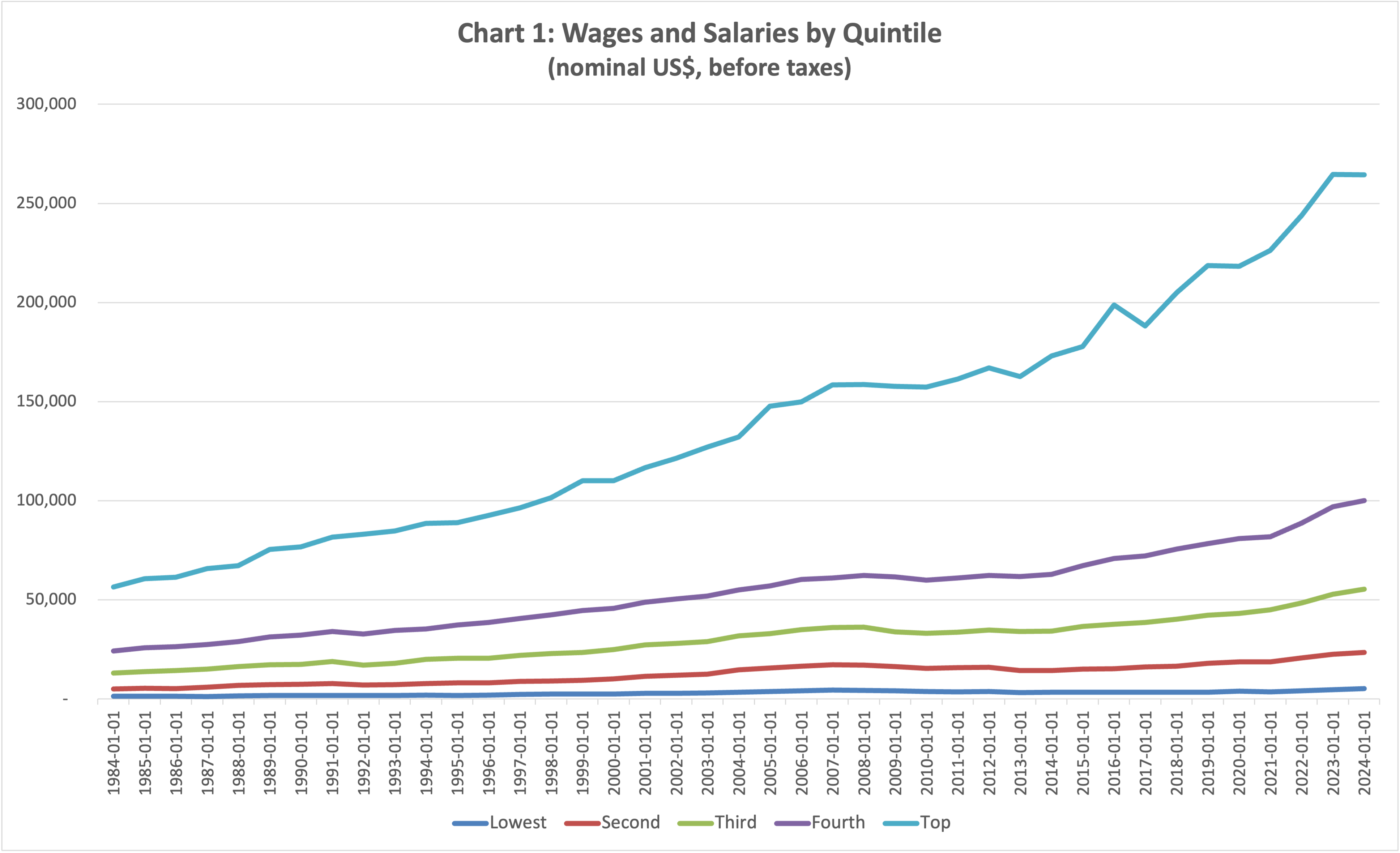
What is your reaction looking at the chart above? Mine is that since 1984, incomes of the top 20% of the distribution have taken off, and nobody else has been able to keep up. The next two quintiles have seen some improvement, but nothing comparable. The second quintile made only marginal gains, and the bottom quintile stagnated.
Look at the next chart.
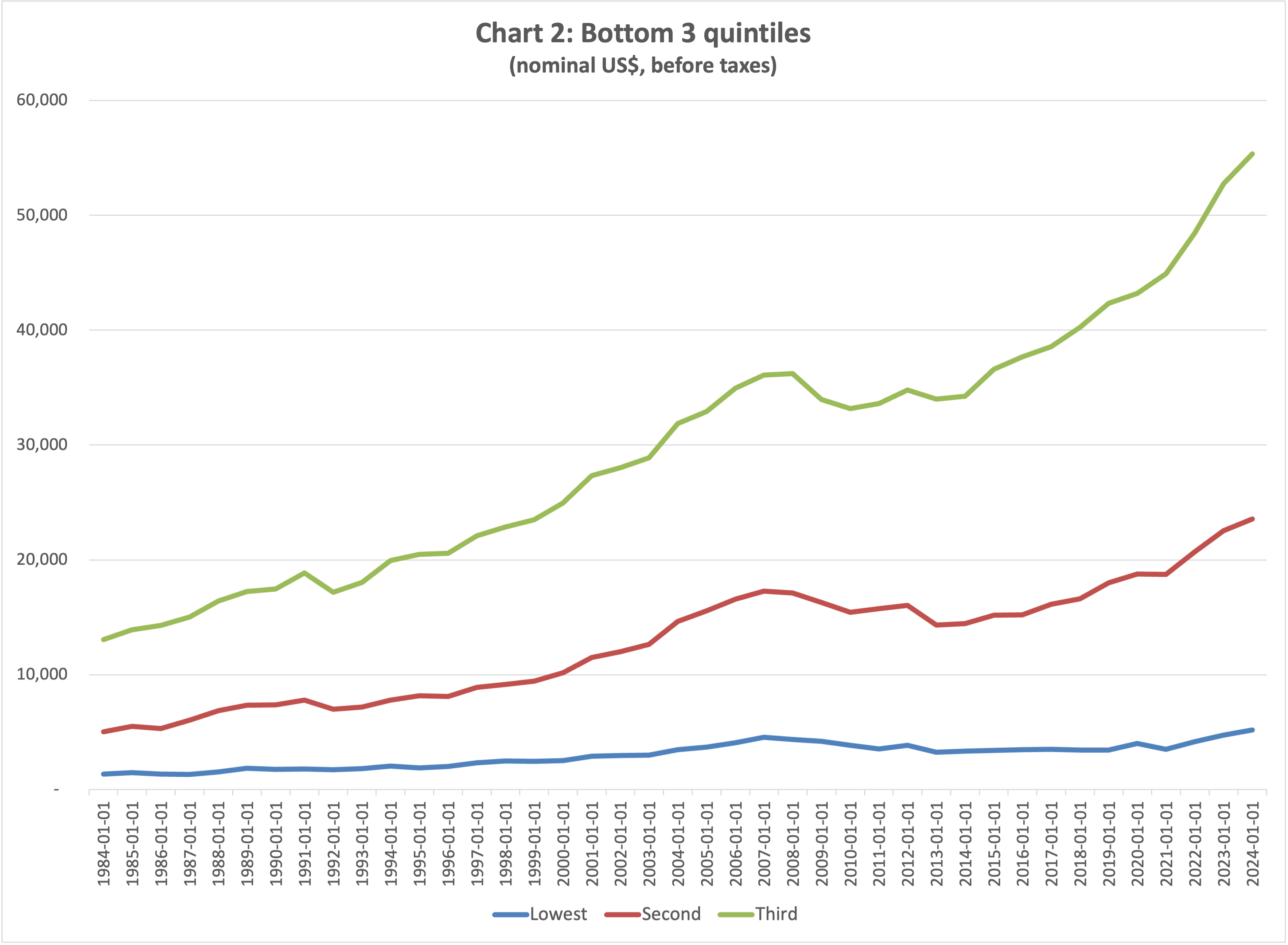
Now it looks like it’s people in the third quintile who made out like bandits — those straddling the middle of the income distribution (from the 41st to the 60th percentile). The second quintile did okay, and the bottom quintile stagnated.
On to the third chart.
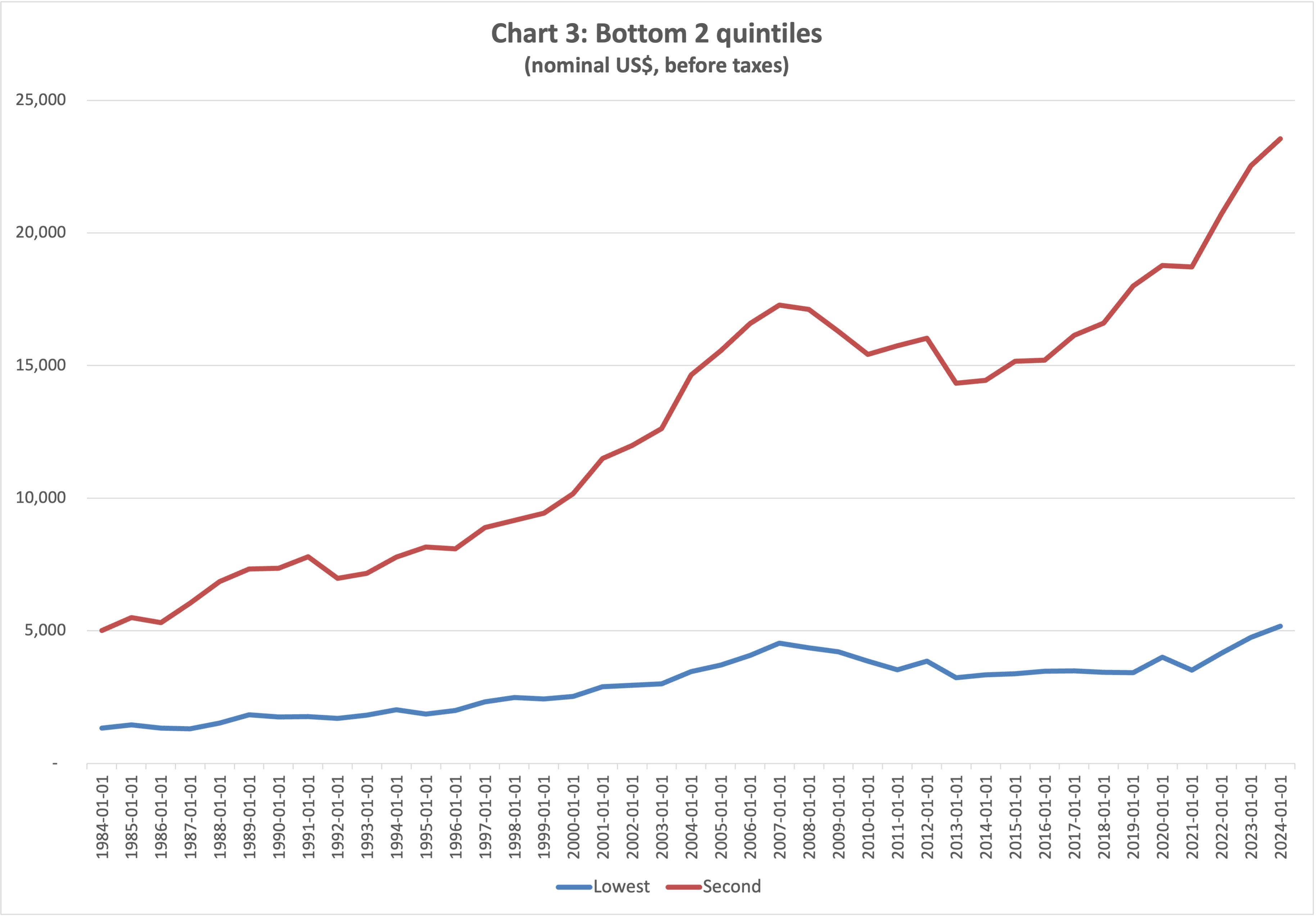
Now the second quintile enjoyed an enormous increase in incomes, and the bottom quintile did see some gains.
Next.
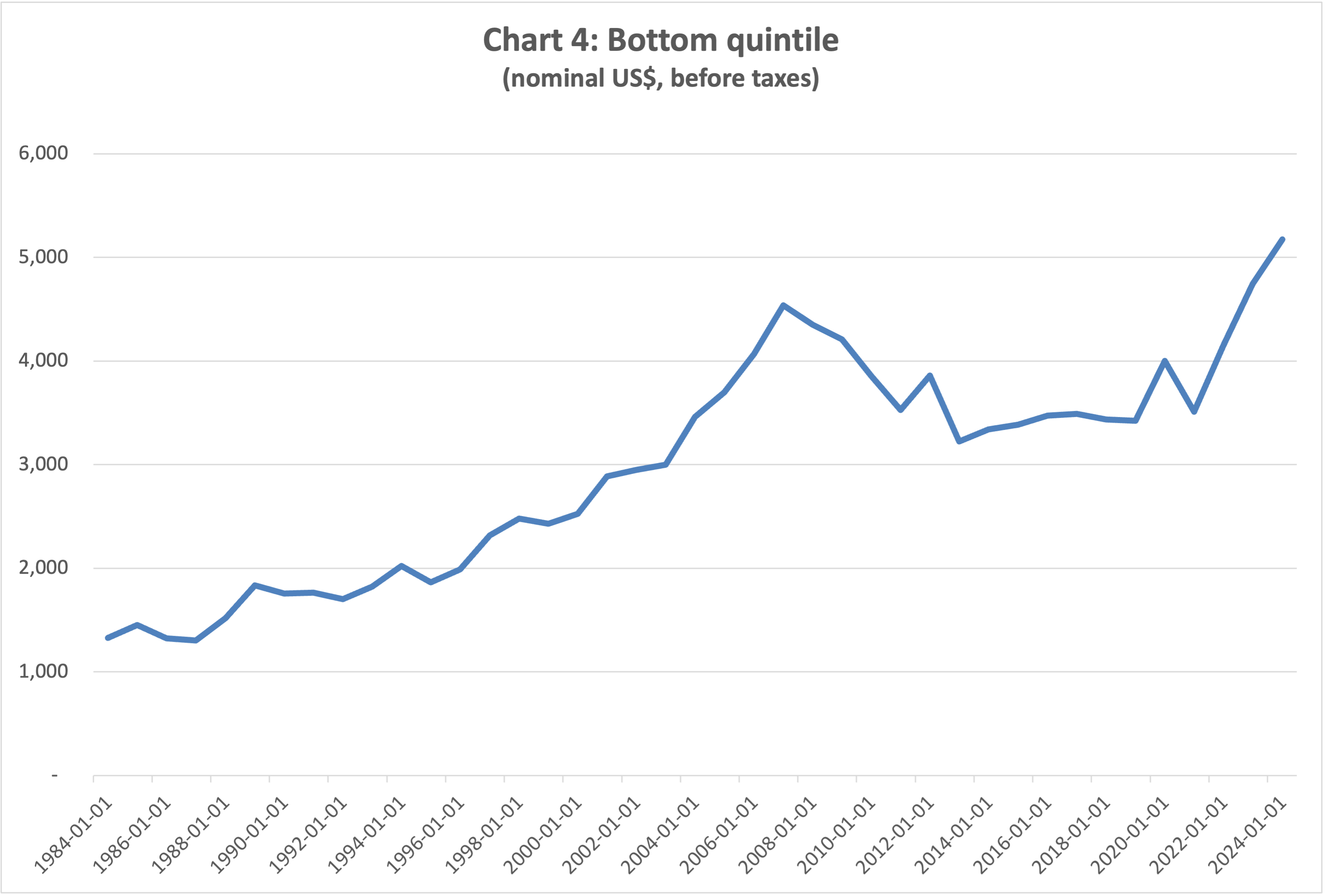
Hmm. Now it looks like the bottom quintile has enjoyed quite a significant increase in income.
Four charts, four different messages, and yet the numbers are always exactly the same.
Not what you’ve been told
Bear with me. For the next chart I deflated incomes by the Personal Consumption Expenditure Index and normalized so that the real income for all quintiles equals 100 in 1984.
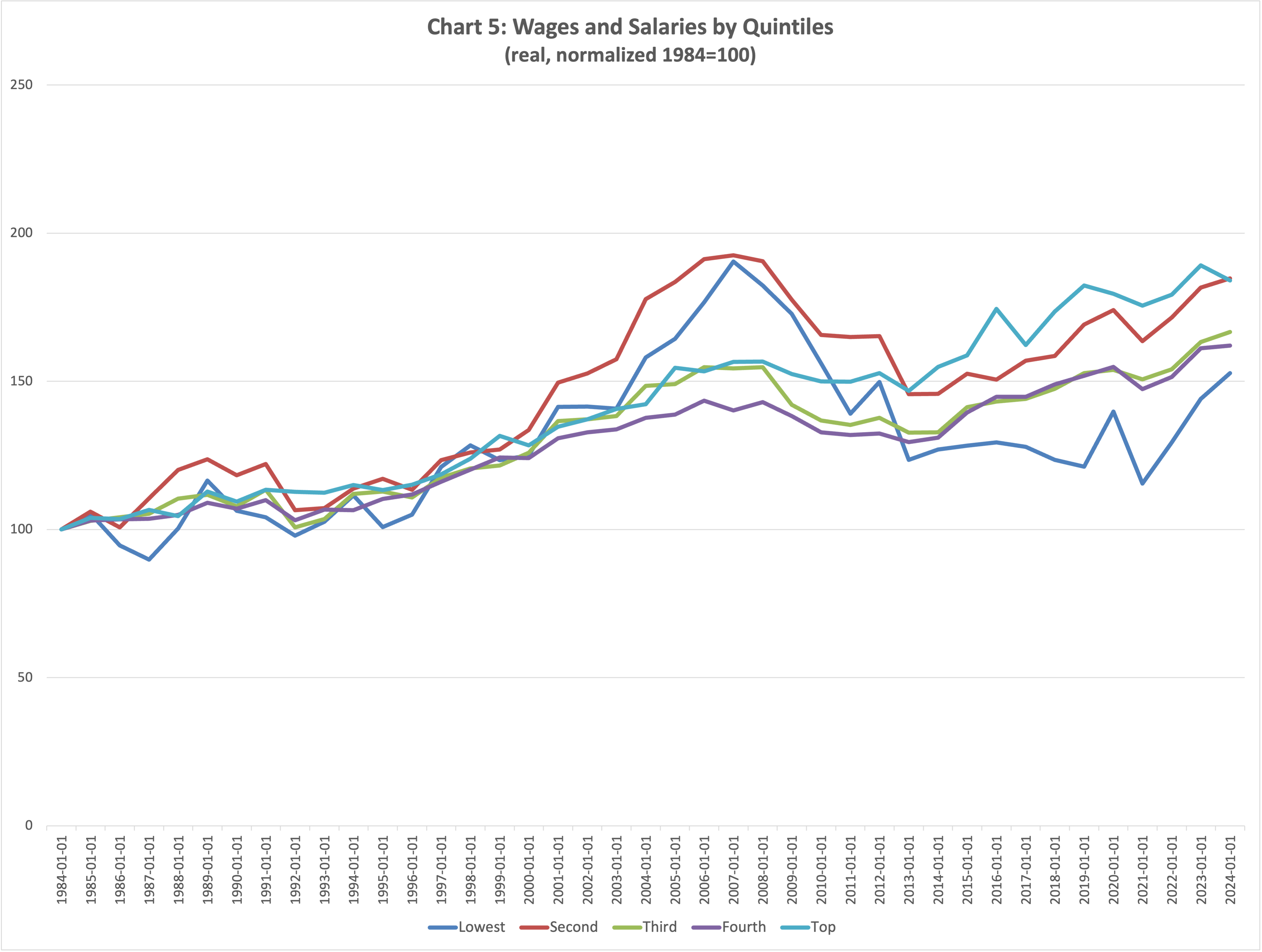
There are a couple of things here that I find interesting.
First, from 2000 to 2007 real incomes for the bottom two quintiles rose at a much faster pace than for the rest. This was the infamous Great Moderation, characterized by a financial and real estate bubble leading up to the global financial crisis. I am not saying there is a relation between the two, but the correlation is intriguing.
Second, over the entire period, the second quintile did marginally better than the top one and the third quintile did better than the fourth:
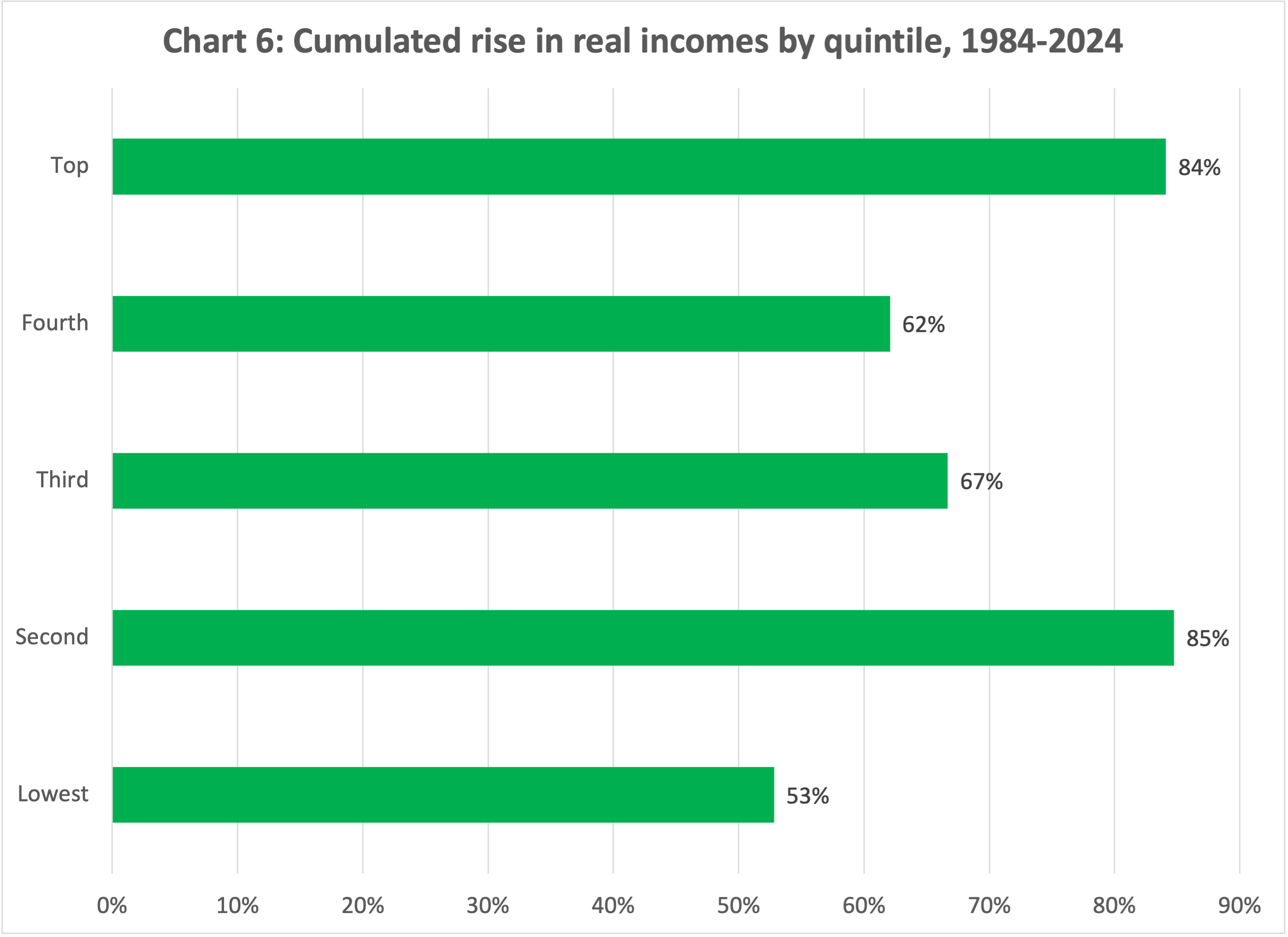
Over the 40-year period, real incomes for the second quintile rose by 85%, a tad higher than the 84% for the top quintile. Real incomes for the third quintile grew 67%, topping the 62% of the fourth quintile. For the bottom quintile, real incomes grew a respectable 53%.
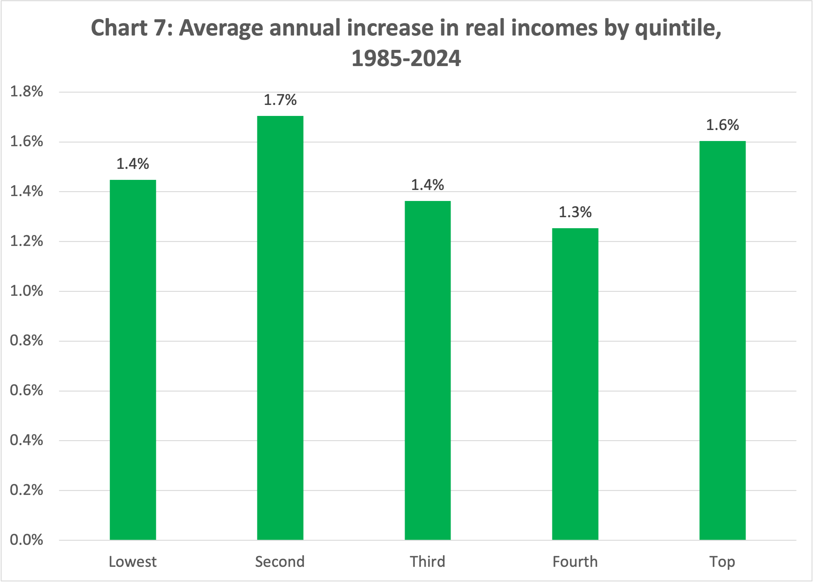
The annual rates of growth of real incomes for the different quintiles, on average, were actually quite close to each other.
Just one last chart, I promise. Let’s take the ratio of each quintile to the lowest quintile.
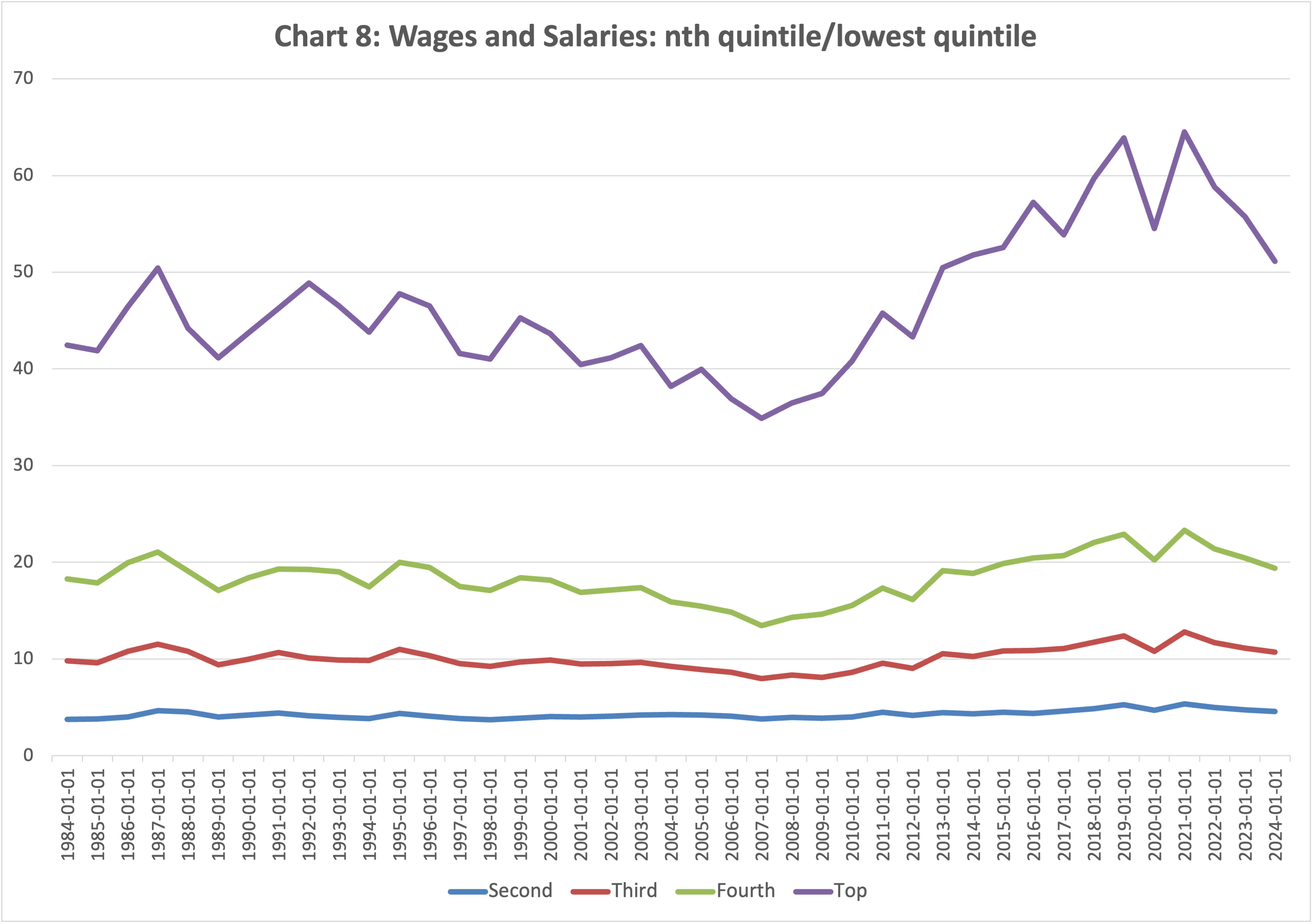
Again, I find this chart quite interesting. For the second, third, and fourth quintile, there is very little change. The second quintile started out at 4x the lowest and gradually edged up to 5x. The third quintile started out at 10x and, with a bit of volatility, is now at 11x. The 4th quintile started off at 18x, went a bit up and down, and now it’s at 19x. The top quintile started at 42x the bottom quintile. It jumped up, then it declined through 2007. It climbed after the global financial crisis, then dropped back over the past three years. It now stands at 51x the bottom quintile level, almost the same as in 2013 and 1987.
A rising tide
I hope your head isn’t spinning. Mine is. Now think back at the first chart. Starting off at very different levels of nominal incomes, even minor differentials in the annual rate of real growth open up a wider nominal gap which, because of the scale, hides the variations in the lower quintiles.
My first takeaway is that over the past 40 years a rising tide has lifted all boats. In fact, as we have seen, it has lifted the boat of the second quintile a tad higher than that of the top quintile. Same for the third with respect to the fourth.
Measured as income ratios, inequality is now a bit higher, but not dramatically so — though the top quintile has indeed pulled further ahead.
Measured in absolute dollar terms, inequality was, and is, wide. As I mentioned earlier, we should keep debating how much inequality we are willing to tolerate. But we should also be wary of policy measures that risk curbing the economic growth that lifted living standards across the entire income distribution.
Remember: over the past 40 years, real incomes for the bottom fifth of the US population have risen by 53%. That’s almost as much as the average for Canada (57%) and better than Switzerland (50%) and Italy (49%). 1
A few caveats. These are data on wages and salaries, so they do not include capital income, which is more important for higher-income households. On the other hand, they are data on incomes before taxes, so they do not take into account the redistributive impact of taxes and social transfers (which I discussed here).
Also, these are data on incomes, not on wealth. As equity prices have surged over the past several years thanks to loose monetary policy, wealth gains have been concentrated at the top.
Finally, these data do not tell us anything about income mobility, which is equally, if not more important, to this discussion. What we should aim for is equality of opportunity, not equality of outcomes, let alone incomes.
Still, a rising tide does lift all boats.
GDP per capita at constant price, percent increase 1984-2024, IMF WEO data.